Introduction
This post seeks to reproduce images as if they had been assembled from the faces of Rubik’s cubes.
Notes
As per usual, a set of trimmed notes are presented here. The scripts are deposited in this file. The raw notebook can be found here
Problem statement
Let $\mathcal{C}\neq \emptyset$ be a set of colours. Then an image, $P$, of size $(m, n)$ is simply a function that assigns a colour to 2D grid indices :
\[\begin{eqnarray} ! n, m & \in & \mathbb{N}: n > 0, m > 0 \quad & \text{(height and width of the image)} \\ % P & \in & \mathcal{C}^{n \times m} \quad & \text{(image)} \\ % \Leftrightarrow p_{i,j} & \in & \mathcal{C} \quad & \text{(colour of the pixel)} \end{eqnarray}\]Let $\emptyset \neq \mathcal{R} \subset \mathcal{C}$ a palette. In our case, it will be the colours of the Rubik’s cube.
Then we seek a function, $T$ that replaces the original colours of the image with those chosen from the palette:
\[\begin{eqnarray} T & \in & \mathcal{T} = \mathcal{C}^{n \times m} \times \mathcal{P}^{n \times m} \, . \end{eqnarray}\]How this tranform function is realised preimarily depends on the aesthetic requirements.
Minimum distance replacements
Single pixel
There is a distance function,$d$ , defined over the colours:
\[d \in \mathcal{D} = \mathbb{R}_{0}^{\mathcal{C} \times \mathcal{C}} \, .\]The distance between two colours is zero if and only if they are identical. In general, smaller distances express larger degrees of similarity. The transform then simply chooses that colour from the palette which minimises the distance:
\[\begin{eqnarray} c^{*} = T(c) = \underset{r \in \mathcal{R}}{\operatorname{arg min}} \left\{ d(c, r) \right\} \, . \end{eqnarray}\]We utilised the fact that a single colour constitutes a matrix of a single row and column, before being called out on the laxity of the formulae.
Multiple pixels
Alternatively, multiple image pixels may be replaced by a single colour. This leads to the reduction of the resolution. The quantity that is being minimised is the sum of individual pixel distances to the palette colours:
\[\begin{eqnarray} ! n, m & \in & \mathbb{N}: n > 0, m > 0 \quad & \text{(height and width of the image)} \\ % P & \in & \mathcal{C}^{n \times m} \quad & \text{(image)} \\ % ! I & \subset & [1, n] \times [1, m] \quad & \text{(selection of grid indices)} \\ % P_{I} & = & \left\{ c_{i}: i \in I \right\} \quad & \text{(image detail)} \\ % c^{*} & = & T(P_{I}) = \underset{r \in \mathcal{R}}{\operatorname{arg min}} \left\{ \sum\limits_{i \in I} d(c_{i}, r) \right\} \quad & \text{(colour closest to all pixels)} \, . % \end{eqnarray}\]Examples
Transform in the RGB colour space
The two images are shown below stacked with their rubikified versions. The colour of each original pixel was replaced by the closest one from the Rubik palette; one that mininised the $L_{2}$ distance in the RGB space:
\[d^{RGB}(c, r) = \left[ (c_{R} - r_{R})^{2} + (c_{G} - r_{G})^{2} + (c_{B} - r_{B})^{2}\right]^{\frac{1}{2}} \, .\]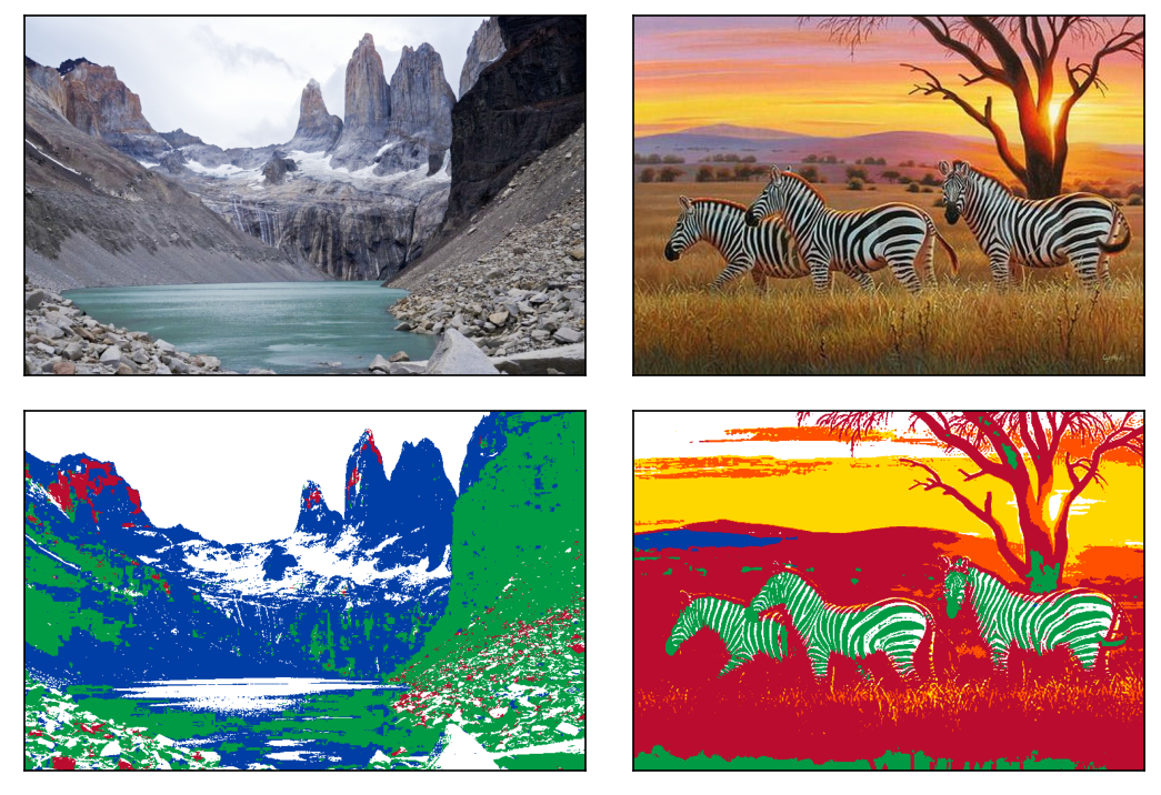
Figure 1. The original images (top row). The RGB transformed images (bottom row).
The first thing to notice is the green stripes of the zebras. Since black is not a colour of the cube, the algorithm replaces it with green which is the most similar to it in the RGB space with the $L_{2}$ distance.
Transform in the CIELab colour space with CIE94 distance
We somehow feel that dark blue is more akin to black than green is. Zebras sporting a Celtic Glasgow outfit is the most plausably not due to their particular dispostion in football, but to the fact that the RGB $L_{2}$ colour distance does not rely on human colour perception. This was recognised early on and colour spaces and distances were developed which were honed to approximate colour proximities as we recognise them. A particularly successfull pair of them is the CIELab space coupled with the CIE94 distance. (The reader is kindly referred to the corresponding Wikipedia article for the details). We, from now on, recourse to this space and distance.
The CIE94 transformed images are juxtaposed with their originals in Figure 2.
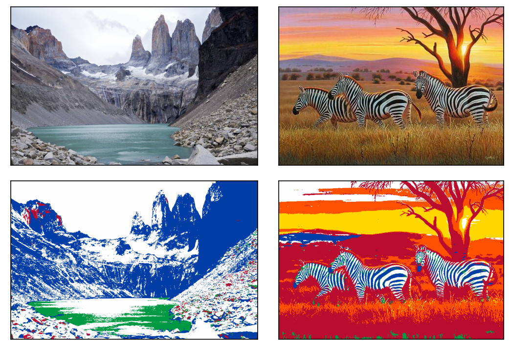
Figure 2. The original images (top row). The CIE94 transformed images (bottom row).
Indeed the stripes are now blue as we previously expected them to be so. The grey slopes of the mountains are replaced by areas dominated by white as opposed to green too.
Dithering
The transitions between colours are somewhat too sharp in the transformed images. For instance, the sky is collated in a suddenly separated sequence of white, orange and yellow bands. The change between the shades is smooth in the original image. This banding can be softened by adding random noise to the pixels of the starting image before mapping it to the restricted palette. By doing so, adjacent pixels that had the same colours will now painted differently, yet similarly. This process is called dithering and has a history of sixty years.
For the sake of a brief explanation, let us assume that the colours range between nought and one. The palette has two of them: 0 (black) and 1 (white). Consider four pixels arranged in a square. Say, they all have the same colour of 0.65. Without dithering we would end up with four white points after the transform.
With dithering,
- the top left will be repainted with “1”.
- half of the error (-0.175) is then added to the top right pixel which will be 0.475 thus repainted with “0”.
- the quarter of the error (-0.0875) is added to the bottom two pixels turning them to 0.5625. Their final colour is therefore “1”.
- In total we have one black (“0”) and three white (“1”) points. Their average colour is 0.75 which is much closer to the initial 0.65 than the all over white through the simple assignment.
By choosing which pixels receive what amount of the error it is possible introduce a randomness which, on average, approximates the original colours.
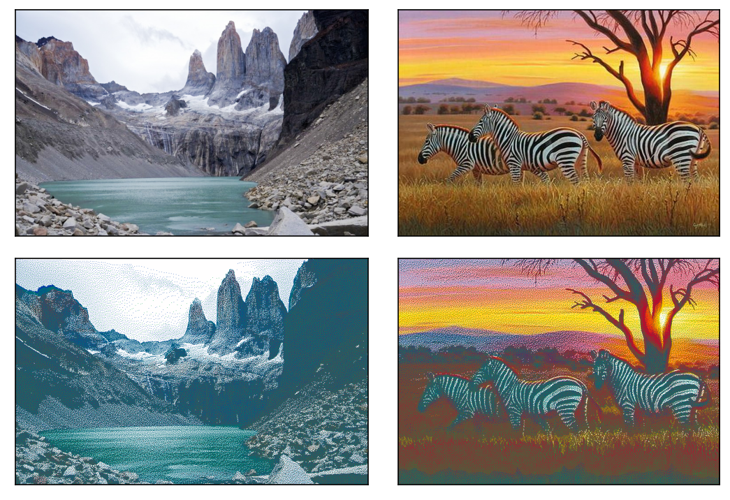
Figure 3. The original images (top row). The dithered CIE94 transformed images (bottom row).
It is remarkable that a palette of just seven colours reproduces the shades to an unexpectedly satisfying degree. This is a result of a handful of facts. Firstly, five of the six cardinal colours of the CIELab space are on the cube: yellow, blue, red, green and white. Apart from black and so tinted colours, all colours are close to a member of this selection. Secondly, the pixels are so tiny that the adjecent squares coalesce (cf. pointilism). Had the transformed image been magnified tenfold, the apparent colours would not have been blended by the eyes (cf. Mondrian). The left and the middle panels of Figure 4. illustrate the breakdown of coalescence in a zoomed-in section of the zebra image.
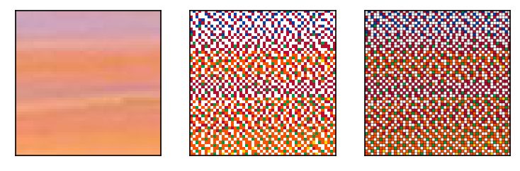
Figure 4. Detail of the original image (left panel). The same area in the dithered CIELab transformed image (middel panel). The same dithered CIELab substituted area with borders (right panel). Please note that the colours of the squares appear darker than they really are.
Adding the borders
Each square of a Rubik’s cube has a black border. The width of a square is 19 millimetres, the sticker stretches across the central 17 by 17 millimetres area. This means that each transformed pixel must have an approximately 5% wide black perimeter to attain that unique Rubik’s feel. The pixels thus cannot anymore be represented by undivided areas. They need to be magnified (19 by 19) times to make space for the black background. The left panel of Figure 4. shows a detail of a properly rubikified image. The entire images can be accessed 1, 2.. Be warned, its area is 90 times that of the original one. (Note, obviously, interlacing (9 by 9) squares with black lines of width of one would result in an imperceptibly similar image. Apart from the edges, where the background would be drawn with the double of its correct thickness.
Colour interpolation
The reader is implored to imagine a properly rubikified picture being hung on the wall of their favourite hipster bar – most likely adorned by equally aesthetic vinyl covers on its both sides. When stading close to the artwork, the black lines separate from the oversized pixels of the transformed picture. As one distances themselves, as they should, from the picture and still facing it, a Rubik’s square becomes a tied but non-blended mixture of the black border and the square. Futher still, the border starts to blend in the enlarged pixel that it embraces. At greater distances, or having consumed sufficient, substantial amount of drinks, a single colour is seen over a square. One that is tinted with black or gray.
It demands but little sobriety to recognise that our multipixel formula is able to find the matching palette colour in all three scenarios to counteract them. Separated and partially blended colours are modelled with a grid of differently coloured pixels. The square over which a fully blended colour spreads is equivalent to a single pixel. In that, it is a special case of the formula below:
\[c^{*} = T(P_{I}) = \underset{r \in \mathcal{R}}{\operatorname{arg min}} \left\{ \sum\limits_{i \in I} d(c_{i}, r) \right\}\, .\]We will only consider the likely event when the colour of the border bleeds in the squares making them darker, but they are still discernible. This requires us to stipulate how to merge colours.
Let us say, $\mathbf{c}_{1}$ and the aptly named $\mathbf{c}_{2}$ are mingled to form $\mathbf{c}_{3}$. The mixing weights are simply the ratios of the distances to the starting colours and the sum of those:
\[\begin{eqnarray} ! \mathbf{c}_{1}, \mathbf{c}_{2} & \in & \mathcal{C} \quad & \\ % \mathbf{c}_{1} & \neq & \mathbf{c}_{2} \quad & \\ % \mathbf{c}_{3} & = & \frac{ d(\mathbf{c}_{1}, \mathbf{c}_{3})}{ d(\mathbf{c}_{1}, \mathbf{c}_{3}) + d(\mathbf{c}_{2}, \mathbf{c}_{3}) } \mathbf{c}_{1} + % \frac{ d(\mathbf{c}_{2}, \mathbf{c}_{3})}{ d(\mathbf{c}_{1}, \mathbf{c}_{3}) + d(\mathbf{c}_{2}, \mathbf{c}_{2}) } \mathbf{c}_{2} \quad & \\ % \mathbf{c}_{3} & = & \lambda \mathbf{c}_{1} + (1 - \lambda) \mathbf{c}_{2} \quad & \\ % \end{eqnarray}\]Regretfully enough, the linear interpolation with the weight above is only correct in Euclidean spaces such as RGB with $L_{2}$ distance. CIELab with CIE94 is not Euclidean. Moreover there is no analytic formula for the distance-based weights therein either. They thus ought to be determined numerically. But we won’t – no matter how exciting or enchanting to spend the evening chatting to unknown equations. If we think about it again, it does not take too long to realise that the insertion of black colour would primarily affect the lightness of the enlarged pixels. What really needed is to only increase the lightness of the original images by the amount which balances the expected darkening, before the transformation. Since the first coordinate of the CIELab space is exactly the lightness, the required procedure is of the simplest kind.
Figure 5. arranges once more the original picture its lightened version and the Rubikified product.
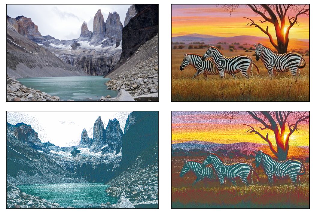
Figure 5. The original images (top row). The dithered CIELab transformed lightened images (bottom row).
Five percent extra lightness was applies to the images. This washed out most of the clouds by The Pinnacles, and the sunset over the savannah has become paler too. The full sized versions are saved too 1, 2.
Finally, it must be remarked that a number of colour theoretical and mathematical nuances have been glossed over in the previous paragraphs. These include gamma curves, colour biases, reusing of calculation results etc. The reader must not be timid, though, to use the utilities linked to this notebook to create their own artwork and strap it on the once plastered wall of a fitting establishment preferably in A0 format, on canvas.